

Representing clusters of lines
Last week we looked at how to visualise results of Monte Carlo simulations. This time, we look at another case where we have to show a very large number of data points

Liverpool FC won the English Premier League. It happened last Thursday, well after I’d sent out the last edition of this newsletter, when Chelsea beat Manchester City 2-1. Since then most of my reading and watching has been consumed by analyses of Liverpool’s title win. So there is no surprise that I’ve picked a graphic (or set of graphics) about Liverpool’s play for this week’s edition.
And, given the topic, it makes eminent sense to write this as I stay up late to watch Manchester City give a guard of honour to Liverpool. Hence, I’m sending this one day late this week (most of this was written before the game actually started, and it’s “interesting” that Manchester City smashed Liverpool after giving them the guard of honour).
This week’s graphs come from The Athletic, a subscription-only sports website. I bought a subscription about a year back, and so far I haven’t regretted it. The writing is first rate (they basically poached a lot of very good football writers from The Guardian). They don’t do match reports, but the analysis is very good and sometimes innovative. Michael Cox, for example, has developed a style of analysing formations and tactics using screenshots from TV.
Recently they hired a football analytics guy. Tom Worville sounds very good whenever he comes on one of The Athletic’s podcasts, but so far I haven’t yet taken to his written communication. He can get a bit verbose and boring, and his graphs are really hard to read.
He did a story on Liverpool’s passing patterns in the ongoing season, in an attempt to bust the myth that Liverpool are purely a pressing team rather than a possession based team. The idea is excellent, and he does a fantastic job of explaining them in this (free to listen) podcast with Michael Cox. The graphs, however, I’m not so certain about.
Here is a sample of graphs that he’s used in the post (sadly, all posts in The Athletic are behind a paywall, but they are currently offering 30-day free trials).


Before we proceed, let’s get the obvious stuff out of the way - the black background jars and makes the graphs hard to process (you can think of this as a rule - avoid dark backgrounds as much as possible. And I’m saying this as someone who uses dark mode on iPhone, WhatsApp, Twitter, and everything else).
There is way too much white space (or should I say “black space”?) in the graph. Clearly, a clustering analysis has been done, but there is no mention of that on the graph. Arrow directions are not clear for the uninitiated. Not sure if line thickness and brightness are appropriate. Legend takes too much space. Etc. Etc.
Now, let us come to how we can actually represent the data that is being represented here. Notwithstanding the clustering, how do we we represent “pass data”, or any other data where each data point moves from one place to another? We had seen in an earlier edition that restricting the number of data points shown helped Kirk Goldsberry draw rather elegant basketball shot maps.
A football pass (or even a shot) varies from a basketball shot in that both start and end points are variable here. So we will need to draw lines here; just starting points won’t do. Rather, just starting or ending points can be useful in certain kinds of analyses, but when you are trying to analyse groups of passes, and trying to draw patterns between them, you need lines.
You might recognise that the problem here is rather similar to what we had seen last week with Monte Carlo simulations. Like a large number of simulations there, here we need to represent a large number of passes (basically lines with start and end points in a given rectangle), in a way that overall trends can be seen while not obscuring individual data points.
The graphs given above give equal weight to each pass, and the overall trend is not drawn, even within cluster. Since Worville hasn’t really shown what each cluster represents, it is difficult to compare the clusters across players as well (he has a line in his analysis that shows that one kind of ball that Salah receives is similar to the kind of pass that Mané makes, but that is difficult to fathom that from the data presented).
I can think of possibly two ways to represent this data efficiently. Both of them use what I call as “major and minor” communication. I don’t have the data that Worville used to make these graphs, but StatsBomb made pass-by-pass data for the 2018 World Cup public (I had downloaded it back then), so I used that to make a map of Alisson’s passes during that tournament (he made a total of 168 passes, so the graph isn’t really THAT dense).
(Hearty thanks to the ggsoccer package for code for drawing a football pitch)
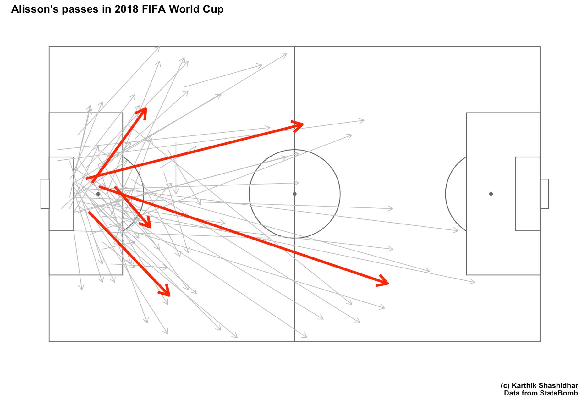
The first way is simple enough. Represent each pass by a rather thin line, which can easily be missed on the first look of the graph. Draw one thick line for each cluster of passes (I used pass start and end location for Alisson in the World Cup to do a quick k-means clustering with 5 clusters. I’m not sure if Worville used the same algorithm for his clusters).
The advantage of using both thick and thin lines is that the overall pattern of passing is quickly visible (you can think of the thick red lines as the dots in Kirk Goldberry’s shot map), and the detail is available for the reader who is especially interested. The thing to take care of here is that the size of the thin lines be varied based on the number of such lines.
The other method is a version of what Worville has made - using small multiples to show passes in each cluster separately, but to continue to use the thin line - thick line combination. I decided to try this with a denser data set, using passes by all goalkeepers in the 2018 WC, rather than just by Alisson. This is what it looks like (I made 6 clusters here for the sake of symmetry).
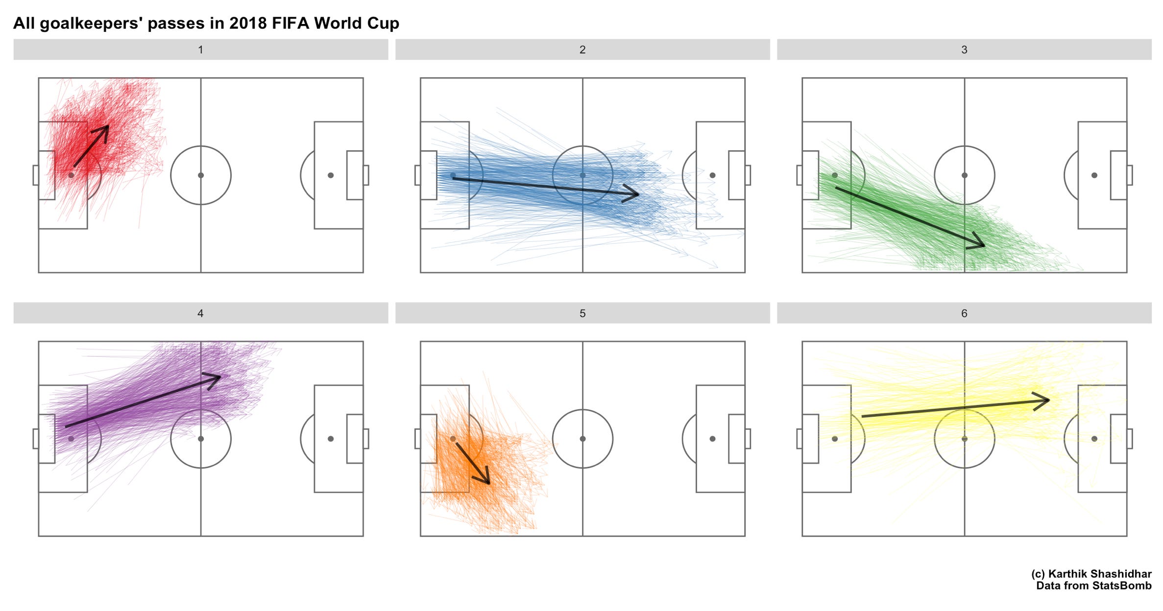
The colours here are strictly optional. What matters here is to have the thin lines and the thick line in different colours. Again, notice that each data point is available for closer inspection, but the overall trends are clearly visible in one view.
I’ve used an example here from football here, but this method of using thin and thick lines can be used to represent other kind of “line data” (or “flow data”) as well. For example, to show movement of people, we could use this combination of thin and thick lines (rather than “Sankey diagrams”). In fact, any data that shows movement on a two-dimensional surface over time can be represented using this kind of thin-line thick-line format.