

Reading between the lines
What do you do when the information in a graph lies in the area between curves? Just label it.

There is this joke going around that the ongoing Covid-19 crisis has turned everyone into an epidemiologist, like how the 2008 Global Financial Crisis turned everyone into an economist.
In fact, lockdown and stimulus measures around the world mean that everyone has turned into an economist this time as well. People have also turned into experts in supply chains, manufacturing, sociology and epistemology. And inevitably, some people have turned into data visualisation experts, producing graphics of different types to chart the spread of the disease.
Overall, I think this is a good thing (and I’m guilty of trying to turn into many of the above mentioned experts). It is inevitable that when there is a crisis, everyone wants to help, or to be seen helping. As long as communication lines are open and no particular set of people dominate this “marketplace of ideas”, what Richard Dawkins first described as “memetic fitness” means that the best of these ideas will come to the forefront.
That everyone is becoming a data visualisation expert means that the sheer variety of graphics that are being produced is far higher than if you were to leave it to “experts” alone. Many of the new ideas may be bad, but certainly there is some good work being done by the non-experts, it will leave the field of graphics richer. You could also think of the work of non-experts being similar to “memetic mutation” (ok I’m stretching analogies here now. On to business).
That said, some of the best visualisations during the crisis have been made by people who were visualisation experts even before the crisis started. Today, we’ll take a look at this graphic made by John Burn-Murdoch, a data visualisation journalist at the Financial Times. This tracks the “number of excess deaths” in each country this year.
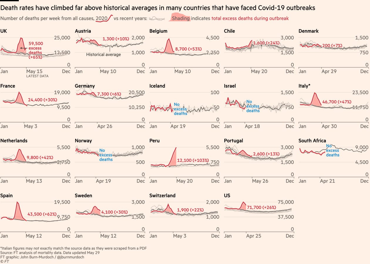
I absolutely love this graphic. For starters, the choice of data is great. Given that mortality due to covid-19 is higher if one is older or has co-morbidities (and thus more likely to die anyway) and many covid-19 cases may be undetected, the number of deaths attributed to covid-19 may be an inaccurate measure. So using the total number of deaths each week, and using “excess deaths” as a proxy for deaths due to covid-19 is incredibly sound.
Data presentation is also first class. The choice of “small multiples” (each country getting its own small graph rather than everything in one graph) is brilliant - else the data would have overlapped too much to provide any meaningful information. The choice of individual scales for each graph means this graph can work for countries of vastly different sizes, and with vastly different “normal” death rates. The ordering of the little graphs is also carefully chosen, with the UK (FT’s home market) in the beginning, and the other countries ordered alphabetically.
I also want to point you to the colour scheme of the lines. The major information here is the difference between this year’s deaths and the average of the last few years’ deaths. Each individual past year doesn’t matter, so the use of thin grey lines to represent earlier years and a thick red line to represent this year’s is sound.
Now, the number of excess deaths in each country is represented by the area between the red and grey lines. This can be tricky since the human eye is usually bad at comparing areas (and far superior at comparing lengths). The problem is further compounded by the use of different scales for each little graph. Hence, explicitly labelling the number of excess deaths (and percentage change) is an excellent decision.
There are other little things that make this graph effective.
For starters, everything is neatly labelled and explained. The headline tells you the main message from the graphic. A different colour (blue) has been used to label countries without excess deaths, drawing attention to them. With different red lines ending in different places (each country releases data with a different delay), the graphic has cleverly used labelling to show until when the data is present (this is pointed out only in the first of the small multiples, so information is not repeated and to paraphrase Edward Tufte, “no ink is wasted”).
The graphic does an excellent job of conveying its central message. Excess deaths in most Western European countries has peaked, and most of them are back to normal (albeit under a strict lockdown). Peru is a big worry. Sweden, despite not locking down, has a similar trajectory to other European countries (though worse than Norway and Denmark). The US is still not out of the woods, but beyond its peak. And so on.
I think I’ve only scratched the surface on what this graphic can teach us. It is a brilliant example of how to tell stories with data. The choice of graphic, the way data is presented, the labelling, the annotations, and success in communicating the message that should be conveyed - this graph has it all.
And the best part is that you don’t need the vast resources of an organisation like FT to make this graph. Using R (which is what I think, based on Twitter, Burn-Murdoch uses), you can make this graph (or at least something close to it) at home, completely automated and without that much effort.
To log or not to log
With the number of people known to be affected by covid-19 increasing exponentially, logarithmic axes (which not so long ago were used mostly by scientists and academics) became mainstream. Here is an article (sent by a reader) that explains why the choice of the log scale was inappropriate, and people took the virus far less seriously because of that.
And here is Burn-Murdoch explaining why the log scale was appropriate (and other design choices he made in his earlier set of graphs tracking the total number of cases). Again highly instructive.
Also, check out this tweetstorm by Burn-Murdoch where he does this excess mortality analysis for sub-national regions. Graphs are similar to what we discussed here, but highly insightful in other ways.

